Consumer App that connects individuals to community hangouts, events, and activities.
Redesign
B2C
Social Network

Overview
As the sole product designer at Flockx, a startup dedicated to building local communities, I spearheaded a comprehensive redesign of our mobile app. This project, aimed at enhancing user discovery of local activities and community connections, was my first major initiative since joining the company.
Over a two-month period, I led the entire design process from concept to launch, working in close collaboration with the CEO, product manager, developers and marketing specialists on a daily basis. This redesign initiative results in a 3X increase in daily active users and a 23% growth in our user base within just two months of launch.
My Role
Solo Product Designer in Community Team
Duration
2 months (from concept to launch)

My Contribution
Led the design of FlockX mobile app from concept to launch as the solo product designer
Directed usability testing sessions and translated insights into actionable design enhancements
Initiated and led design workshops with the product team, fostering a robust design culture within the organization
Established a scalable design system for FlockX adopted across business and engineering teams, enhancing design consistency and accelerating feature development cycle
BUSINESS PROBLEM
As many startup companies, we care a lot about...
Finding Product Market Fit
💡
Prove product market fit by effectively building our user base and achieving strong user engagement, validated by both qualitative and quantitative data.
User Satisfaction Rate
User Growth
User Engagement
(DAU)

USER PROBLEM
How might we...
facilitate an engaging discovery journey for users to find third places and where their flocks are active in the community?


MEET OUR USERS
With the problems outlined, who are the faces behind the problems...?
Let's meet Alex and Sarah!


These personas helped me identify common threads: a need for reliable and centralized local information, a desire for connection, and a struggle to navigate the local community and be aware of what's happening around them.

Based on the insights from personas, I broke down the user journey into three phases: Discover, Engage, and Connect. Given our startup's limited resources and the need for focused improvement, we decided to concentrate our efforts on the 'Discover' phase for our MVP. This would lay the foundation for future enhancements in the 'Engage' and 'Connect' phases.
CURRENT USER JOURNEY
STEP 1
Understanding the current journey through flow mapping & design audit
I began by dissecting our existing app, by mapping out the current user flow and conducting design audit to identify opportunity gaps and areas for improvement.

Mapping out user flow to understand current journey & document areas for improvement


Conducting design audit using heuristic evaluation to identify usability issues & opportunity gaps
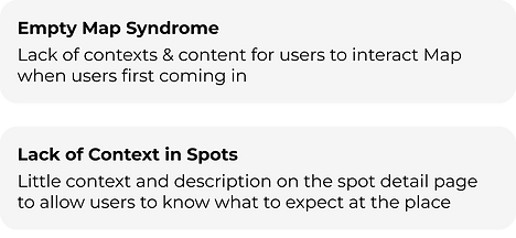
Opportunity Gaps
💡

USER RESEARCH
STEP 2
Validating assumptions with more evidence from users
To validate our assumptions and gain deeper insights, I conducted a comprehensive analysis of user feedback. This involved two key sources: Our existing user feedback database (not been analyzed before) & Fresh results from a new user feedback survey I initiated
I used affinity mapping to synthesize this wealth of information . This involved aggregating feedback from both sources onto color-coded notes: red for pain points and blue for opportunities. This visual approach allowed patterns to emerge organically, confirming some of my initial assumptions while also revealing new insights.


Insights from Aggregated Feedback
💡


BRAINSTORMING
STEP 3
Bridging User Insights and Product Solutions
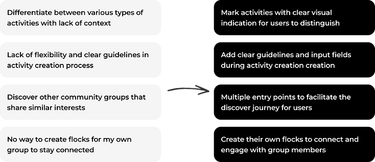
Based on the pain points and insights from my research, I started to brainstorm on the potential solutions. My goal was not just to solve problems, but to imagine new possibilities that could delight our users.
I struggle with...
I wish...
PRIORITIZING
STEP 4
Aligning & Prioritizing as a Team
But...what should we build first?
I led a Prioritization Workshop to walk the team through research efforts, insights, brainstormed features and decide on what to build first using RICE (Reach, Impact, Confidence, Effort) framework. This helped us align on our MVP features.
RICE Framework

DESIGN ITERATION
STEP 5
Transitioning from Dark to Light Mode
A significant aspect of our redesign was the shift from a dark theme to a light theme. This decision wasn't made lightly (pun intended). We carefully weighed the pros and cons:
Light Theme
Modern and simple feel
Better readability and accessibility
Familiar to users of other social platforms
Potential eye strain during long scrolling sessions
Dark Theme
Stylish, often used in entertainment and web3 apps
Easier on the eyes in low-light conditions
Can compromise readability and accessibility
After discussion with our CEO and PM, we chose the light theme. This decision was based on our target demographic (25-44 year-olds), daytime usage patterns, and accessibility needs. The change aligns with our goal of creating a more user-friendly, readable, and familiar interface.
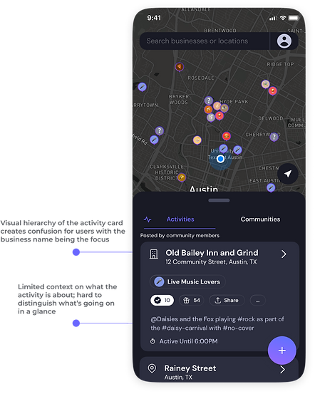
PAIN POINT #1
More Context & Visual Indication Around Activities
Before
After
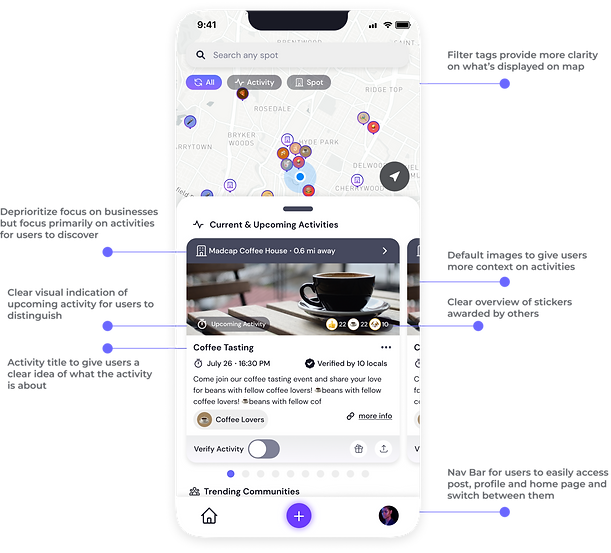
One of the major iterations is the activity card redesign. I experimented with various layouts, information hierarchy and visual cues to highlight crucial details such as date, time, location, and community engagement, making the discovery process more intuitive and informative for our users.
Initial Explorations


Before
After


PAIN POINT #2
Multiple Discovery Stream to Improve Engagement
Before

After

PAIN POINT #3
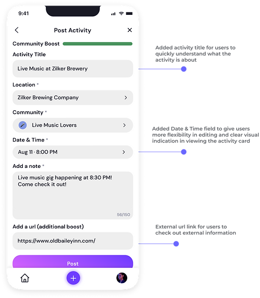
Clear Guidelines in Activity Creation
Before

After
DESIGN SYSTEM
STEP 6
Ensuring design consistency and accelerating dev cycle
Recognizing the need for scalability and design consistency, I took on the challenge of creating a comprehensive design system. I built a component library from scratch, ensuring it aligned with our development team's Tailwind CSS workflow. This not only accelerated our current redesign but laid the groundwork for consistent, rapid design iterations in the future.

A few snapshots...


USER ENGAGEMENT STRATEGY
STEP 7
Driving Retention Through A Multi-Channel Approach
Working closely with our marketing specialist, I mapped out various touchpoints in the user journey to boost retention and engagement. We focused on three key areas: Pop-up messages, Empty states, and Email communication, to bring users back and trigger re-engagement.
Pop-up Message

Empty States

Email Communication

USER ACQUISITION STRATEGY
STEP 8
Crafting a Compelling First Impression by Revamping Marketing Website
Recognizing the marketing website as our digital storefront, I spearheaded its complete responsive redesign to align with the product value proposition. By ensuring consistency between our marketing site and the app experience, we created a seamless journey from initial discovery to active app usage. This revamp not only improved our online presence but also contributed to a significant increase in new user sign-ups.


So...What impact did this project make?
Two months after launching our redesigned app, the results spoke volumes.


But numbers tell only part of the story. Let's see what the users have to say...

